|
About This Site : Getting Started | Contact | About This Project | How To | Honors | Credits | Tech Info
How To Make a Site Like This
Overview
Managing the 1704 Website Project
Design and Production
Technology
Design and Production
Page Contents:
Introduction | Developing the Design | Testing the Design | Producing the Design
Introduction: the role of design in an educational website
Design and Concept Development
On a complex or innovative web project such as ours, involving a designer from the beginning of the process is crucial. The designer helped to shape the overall organization and user experience of the site during the earliest phase of the projectwhen we were developing the grant application for the NEH planning grant.
Visualization and Concept Development
By providing rough sketches and draft content organization charts, the designer was able to help focus and clarify the early conceptualization of the site during a phase that is characterized by overwhelming possibilities and confusing or conflicting potential directions. Having something concrete to respond to makes the process of conceptualization more efficient.
Structured Thinking
Good design and good organization go hand in hand. Good organization leads to easier content development and clean efficient programming. All this add up to a more consistent and user-friendly website. Good design does more than make a site look appealing; it provides structure and organization to the content, which in turn makes for clear, consistent and easy to use navigation for the user. When a site is well and rigorously organized, it is easier to write the text, easier to develop the technical underpinnings and easier, more memorable, and more enjoyable to explore. The organization of the site can be a group effort, or the work of any individual on the team, but it is important to stress that organization and a careful adherence to the structure are essential to making a clear, navigable site.
User Advocate
Another contribution that a designer is uniquely suited to offer is advocating for the users of the site. In many website projects, early planning is undertaken solely by content experts. Experts can be so enamored of, and engrossed in, the detail of the subject that they lose sight of the interests and needs of the general public. If the site is intended for experts, then it can be shaped by experts, but if the site is targeted to a general audience, then a designer who makes user interfaces is an appropriate person to act as the users' advocate. The content experts speak for the needs and opportunities of the content; the technical leader speaks for the needs and opportunities of the technology; and the designer speaks for the needs of the user. These three roles form a synergistic team that when effectively led by a project manager, can truly make the whole project than the sum of the parts. There is an inevitable yet potentially very productive tension among these roles. Ultimately, each role is essential and needs to be balanced with the others.
The designer can help manage this kind of collaboration by providing a visual and conceptual structure within which the other team members can contribute. When she makes ideas visible with sketches, mockups and demos, ideas can be more easily evaluated and revised.
Developing the Design
A "High Concept"
As we set out to develop our site, it helped us to establish a "high concept" early in the process. For our site this concept was to tell the story of the Raid from multiple perspectives. This concept was driven by our pedagogical goals. The other overriding goal of our site was to reach a general, non-expert audience. These two goals, once clearly defined, were enormously helpful throughout the development process. They served as touchstones that allowed us to evaluate the many design decisions we faced along the way. For example, in our initial plan for the site we had placed Deerfield at the center of the story and had focused simply on the Raid and the local events immediately preceding it.
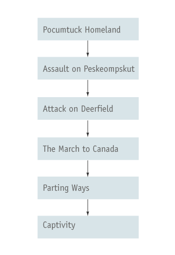
However, in order to include information about each culture's history, we scrapped our original model and rethought the content the site would cover. In the revised model, we incorporated earlier historical events that were of importance to each culture; many of these events occurred outside the Deerfield area and much earlier in history.
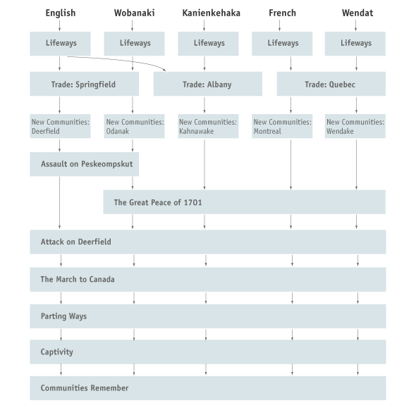
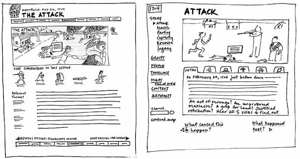
This new content structure gave us a new direction for the web site, motivating us to redesign our fundamental conceptual model, changing it from a Deerfield-centric model to a more cultural group-inclusive model. As we changed the content included in the site, the structure of the site changed. When the structure changed, the user interface needed to change to express this new structure. As a result, a redesign of our primary pages the historical scenesquickly ensued. We rethought the design to emphasize and provide easy access to each group's perspective on the story. Here are two early rough sketches showing designs before and after that meeting. In the first sketch, the event and illustration are interpreted with a single text. In the second, we've provided interpretative text from the viewpoints of all five cultural groups. This text is accessed via the tabs you see directly below the illustration.
Designing For Your Audience
By researching user statistics on the web, we learned that the majority of our audience was using monitors set to 800 x 600 resolution. This knowledge motivated a major redesign of the interface so that most of the primary pages would fit on a screen without scrolling. Even though this reduced screen size gave us less room for text, we felt it was more important to retain the strong, at-a-glance relationship between the illustration and the text without the need to scroll back and forth. Long pages are fine when using mostly text, but our primary pages are mostly visual and interactive and didn't work well if the users couldn't see them in as a whole.
|
|
Iterative Design
Throughout the design process we used sketches and mockups to evaluate our ideas. Earlier in the process, thumbnail sketches of pages (as seen in the examples above) were enormously helpful because they were quick and easy to generate and painless to discard. As the design progressed and became more solid, we moved to mockups. Depending on the nature of the design problems we were seeking to solve, these mockups took the following forms:
- Thumbnail sketches, or more detailed screen sketches, to evaluate page layout and site structure. Small thumbnails of pages help give the team a sense of the overall structure of the site better than a more abstract flowchart can.
- Static image files made in Photoshop or Fireworks to evaluate visual design elements such as typography, color, and layout.
- Linked "skeleton" html pages to evaluate site structure and linksthese are html pages that use only the minimum of information and functionality to communicate the essentials, often simply a page title, Greek text and essential links; no color or graphic treatment. The idea is for them to communicate what it feels like to move thru a section of the site, yet still be quick to make and easy to revise.
- "Mini-site" to evaluate the look and feel and tone of a small subset of the sitea mini-site is a few linked pages that are fully designed. For example, when we were developing the Home page, we had a difficult time deciding how to present the site introduction, the splash page and the options on the home page itself, so we made various configurations of these pages till we felt we had the distribution of options as we liked it.
- An alpha site for more of a full evaluation or user testfor our alpha test we tried to make at least one of each kind of page with the look and feel as polished as we could get it. We implemented as much technical functionality as we could at this early stage in the development process. For the features that we weren't able to program we created mock-ups of them.
The idea with iterative design is to generate many concrete versions that are easy to evaluate and learn from and then to move on to the next one. The detail and polish of the mock up needs to be appropriate to the stage of development the site is in. For example, in the early stages of the process, it doesn't make sense to generate real html pages complete with graphics because the design is still in flux and the time it takes to generate these pages will be wasted.
Inspiration
In addition to iterative design cycles, it's extremely helpful for the team to be regularly looking at and discussing other, relevant web sites. This is a way to discover new features and interface ideas and to learn about the various graphic likes and dislikes of the team. Learning from other web developers' efforts saves enormous time and effort there is no sense in reinventing the wheel.
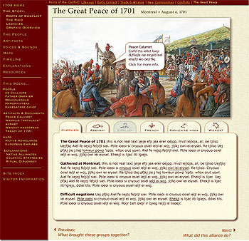
During our design development, we were impressed with a site produced by WGBH, (the PBS station in Boston) called Commanding Heights, because it did a good job of communicating a lot of dense, linked information in a clear way. As a result, we redesigned our site to incorporate a content structure idea that we felt would work well for our site: pop-up windows for the information that linked to each historic scene. All the supporting pages that are linked to from the historic scenes open in windows that are on top ofbut do not obscurethe historic scene page. This design reinforces the content structure of the sitepresenting supporting information in a clear visual and structural relationship to the historical narrative. The historic scenes and main menu pages are shown in the parent window and form the conceptual foundation level of the site. All the other content appears in reference to this levelin other words, the other content appears on top of this level, in child windows. So the parent-child page structure reinforces the parent-child content structure. In this way, navigation parallels learning, and each click to follow a link underscores the conceptual framework of the material.
Testing the Design
We conducted several rounds of user testing over the course of the development process. These testing sessions varied depending upon the phase of development the site was in. In the early stages of development we informally interviewed patrons at a public library, asking them to look at a single rough-draft page and give us their impressions and opinions about writing style, overall page layout and the notion of multiple perspectives. As the design and technology were further developed, we brought in users for more formal sessions. These sessions were set up to test about 10 subjects; each subject was given about 30 minutes to explore the site at will while two team members observed. After exploring the site the subject was interviewed and asked to respond to a written questionnaire. We conducted two tests that followed this format -- one that corresponded to an alpha phase of the site and the other that was considered to be a beta test in which the site was more complete. We also conducted "mini-tests" from time to time in order to try and evaluate specific pages or features.
Design Refinement
Be sure to schedule in a review period just before launch when the team can refine the design of the site. Once the site's content and technical functionality is fairly complete, there are always unforeseen situations that emerge. Also during this time you should be sure to check your site on all the various platforms and browsers to catch and inconsistencies in how the browsers render the site's pages.
Another experience that proved extremely helpful for us was the opportunity of having colleagues critique our site. We signed up for a "Crit Session" at the Museums & the Web conference and while it was painful to hear about the flaws and problems of our site, the information we learned from this session was put to good use; we redesigned the Home page and primary navigation as a result of the input from colleagues.
Using Plugins
We weighed the advantages of using plug-ins such as increased interactivity, audio, more appealing interface, more control over design details, against the disadvantage of burdens on the user. But when measured against our goal of providing multiple perspectives, we felt that the ability for the user to quickly and seamlessly jump from one perspective to another was critical to the success of the site, so we decided to use Flash. We produced the Flash files so that the text and link content in each scene could be edited by the writers and then dynamically updated into the Flash file. This meant that the design and production team weren't burdened with re-producing the Flash each time an edit was made; as a result, the writers could refine as often as they liked.
Producing the Design
Illustration Development
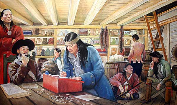
We decided early on to work with artists to create historically accurate illustrations of the main historic scenes. We decided this for several reasons: our subject matter took place 300 years ago, and available period imagery was scarce; we wanted the site to be highly visual in order to draw visitors into the material; and we felt that imagery would be a "quick read"; that is, it would enable us to communicate a lot without using words.
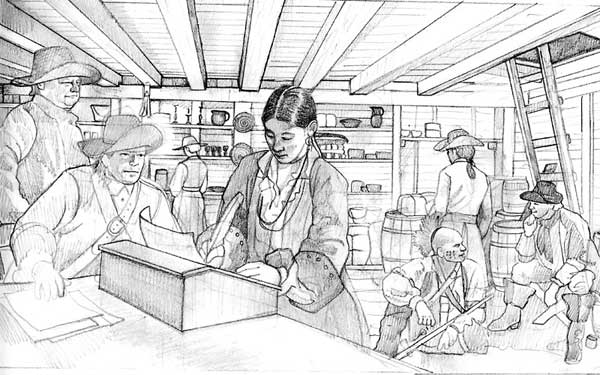
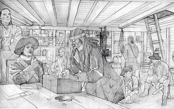
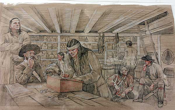
The accuracy of the illustrations was as critical as the accuracy of the writing. As a result, each illustration was carefully reviewed by content experts and revised several times. The following describes our illustration process:
- The content expert first wrote an outline describing the content the illustration should include and its time period. She also compiled a list of resources and reference materials for the artist to look at and/or read.
- The designer added any ideas about composition and/or setting.
- The artist reviewed this information and, after asking questions, sketched in pencil and submitted her first rough draft.
- The first rough draft was posted on the team site, so the appropriate reviewers could see it and then submit feedback to the designer. It was important for the reviewers to channel all comments through the designer since their input was sometimes conflicting and would have been difficult for the artist to sort through.
- The artist then created a second rough draft, also in pencil, and it was posted alongside the first on the team site.
- Another review cycle ensued; and sometimes even a third cycle to iron out details.
- The artist submitted the final color version for review, and small changes were made if critical. Usually all problems were solved by this point in the process.
Picture Research
In addition to the historical illustrations commissioned for the site, we also used many images to illustrate the text: artifacts, documents, paintings, prints, etc. the resources required for this aspect of the project were much greater than we anticipated. Finding, reviewing, acquiring, labeling and keeping track of images is detail-oriented, time-consuming and often expensive. A system for tracking, storing and accessing images should be implemented early in the project. We stored all our images on a hard drive (keeping the original CDs the images came on as a back-up set.) We used Extensis Portfolio as an image database as well as our Illustration Tracker to keep track of each illustration's progress.
Image Processing and Archiving
Raw Files: Since image files came from a variety of sources, the original files were stored with their original name, on their original medium: either CD or zip disk. We created a Portfolio Image Catalog to provide easy access to these files. This comprised the Originals archive.
Master Files: We then processed these original files, using Photoshop to correct color balance, sharpen or crop the image, and retouch any dust spots. Images were then saved in TIF format and named with the correct shortname (shortnames are file names that correspond to the database pointers, so that images appear in the correct places within the site.) These master files were then burned to CDs and indexed using Portfolio to create the Masters archive.
These master files were also copied onto an external hard drive. If any of the master files required revision, the new master would be saved on the external drive.
After each new delivery and review of master files, the hard drive was re-catalogged using Portfolio. This catalog referenced the hard drive archive and was posted online on the team site so that everyone on the team could browse it using the free Portfolio browsing software available from the Extensis web site.
Any subsequent changes to the Master file needs to replace the original Master file on the hard drive and the catalog needs to be updated and reposted. At each major upload cycle, the external hard drive and catalogue were backed up onto the PVMA server.
Derivative Files
After creating the Master files, we created derivative files (currently in MrSid format), also named with the correct shortname. These files were uploaded to the development server, as well as copied onto the external hard drive.
|